In this tutorial you’ll able to create a css [cascading style sheet] blocks for your web site.
Below are the some of examples you can refer .
Creating beautiful hyperlink buttons with CSS blocks.
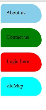
Example 1.
<html>
<head>
<style>
#corner1{
  border-radius: 15px 50px 30px 5px;
   background: skyblue;
   padding: 20px;
   width: 100px;
   height: 25px;
}

#corner2{
  border-radius: 15px 50px 30px 5px;
   background: green;
   padding: 20px;
   width: 100px;
   height: 25px;
}


#corner3{
  border-radius: 15px 50px 30px 5px;
   background: red;
   padding: 20px;
   width: 100px;
   height: 25px;
}

#corner4{
  border-radius: 15px 50px 30px 5px;
   background: cyan;
   padding: 20px;
   width: 100px;
   height: 25px;
}
</style>
</head>
<body>
<p id="corner1"> About us </p>
<p id="corner2"> Contact us </p>
<p id="corner3"> Login here </p>
<p id="corner4"> siteMap </p>
</body>
</html>
output of the above code is:
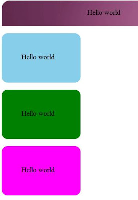
Example 2.
<html>
<head>
<style>
#corner1{
  border-radius: 20px 20px 0px 0px;
   background: khaki;
   padding: 20px;
   width: 950px;
   height: 25px;
background-image: url("ubuntu.png");
}

#corner2{
  border-radius: 15px 15px 15px 15px;
   background: skyblue;
   padding: 50px;
   width: 100px;
   height: 25px;
}

#corner3{
   border-radius: 15px 15px 15px 15px;
   background: green;
   padding: 50px;
   width: 100px;
   height: 25px;
}

#corner4{
  border-radius: 15px 15px 15px 15px;
   background: magenta;
   padding: 50px;
   width: 100px;
   height: 25px;
}

#corner5{
  border-radius: 15px 15px 15px 15px;
   background: red;
   padding: 50px;
   width: 100px;
   height: 55px;
font-size:22pt;
color:red;
background-image: url("solid.jpg");
background-color: blue;
}
</style>
</head>
<body>
<p id="corner1"><marquee> Hello world </marquee> </p>
<p id="corner2"> Hello world </p>
<p id="corner3"> Hello world </p>
<p id="corner4"> Hello world </p>

<table border=0 cellpadding=2 cellspacing=2>
<tr bgcolor=khaki>
<th> Course Name</th>
<th> Duration </th>
</tr>

<tr>
<td> Web  </td>
<td> 2 Months </td>
</tr>
<tr>
<td> Android App Development </td>
<td> 2 Months </td>
</tr>
</table>

<h2 id="corner5"> Welcome to inline CSS </h2>
<img src="d:\web-design.jpg" id="corner5">
<h3 id="corner4"> Welcome </h3>
</body>
</html>
output:
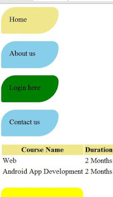
Example 3.
<html>
<head>
<style>
#corner1{
  border-radius: 35px 15px 50px 5px;
   background: khaki;
   padding: 20px;
   width: 100px;
   height: 25px;
}

#corner2{
  border-radius: 35px 15px 50px 5px;
   background: skyblue;
   padding: 20px;
   width: 100px;
   height: 25px;
}


#corner3{
  border-radius: 35px 15px 50px 5px;
   background: green;
   padding: 20px;
   width: 100px;
   height: 25px;
}

#corner4{
  border-radius: 35px 15px 50px 5px;
   background: skyblue;
   padding: 20px;
   width: 100px;
   height: 25px;
}

#corner5{
  border-radius: 15px 15px 15px 15px;
   padding: 50px;
   width: 100px;
   height: 55px;
font-size:22pt;
color:red;
background-color: yellow;
}
</style>
</head>
<body>
<p id="corner1">Home </p>
<p id="corner2"> About us </p>
<p id="corner3"> Login here </p>
<p id="corner4"> Contact us </p>

<table border=0 cellpadding=2 cellspacing=2>
<tr bgcolor=khaki>
<th> Course Name</th>
<th> Duration </th>
</tr>

<tr>
<td> Web  </td>
<td> 2 Months </td>
</tr>
<tr>
<td> Android App Development </td>
<td> 2 Months </td>
</tr>
</table>

<h2 id="corner5"> Welcome to inline CSS </h2>
</body>
</html>
Output:
Example 4.
<!DOCTYPE html>
<html>
<head>
<style>
div.img {
margin: 5px;
padding: 5px;
border: 1px solid #ff0000;
height: auto;
width: auto;
float: left;
text-align: center;
}
div.img img {
display: inline;
margin: 5px;
border: 1px solid #ffffff;
}
div.img a:hover img {
border: 1px solid #0000ff;
}
div.desc {
text-align: center;
font-weight: normal;
width: 120px;
margin: 5px;
}
</style>
</head>
<body>
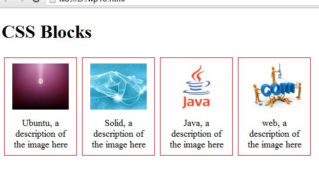
<h1> CSS Blocks </h1>
<div class="img">
<a target="f3" href="wp2.html"><img src="ubuntu.png" width="110" height="90"></a>
<div class="desc">Ubuntu, a description of the image here</div>
</div>
<div class="img">
<a target="f3" href="wp3.html"><img src="solid.jpg" alt="Solid" width="110" height="90"></a>
<div class="desc">Solid, a description of the image here</div>
</div>
<div class="img">
<a target="f3" href="wp4.html"><img src="java-logo.jpg" alt="java" width="110" height="90"></a>
<div class="desc">Java, a description of the image here</div>
</div>
<div class="img">
<a target="f3" href="wp5.html"><img src="web-design.jpg" alt="web" width="110" height="90"></a>
<div class="desc">web, a description of the image here</div>
</div>
</body>
</html>
output:
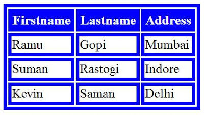
Example 5. Table with CSS properties.
<html>
<head>
<style>
table, td, th {
    border: 5px solid blue;
color:black;
}

th {
    background-color: blue;
    color: white;
}
</style>
</head>

<body>
<table>
  <tr>
    <th>Firstname</th>
    <th>Lastname</th>
    <th>Address</th>
  </tr>
  <tr>
    <td>Ramu</td>
    <td>Gopi</td>
    <td>Mumbai</td>
  </tr>
  <tr>
    <td>Suman</td>
    <td>Rastogi</td>
    <td>Indore</td>
  </tr>
  <tr>
    <td>Kevin</td>
    <td>Saman</td>
    <td>Delhi</td>
  </tr>
</table>
</body>
</html>
output:
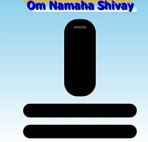
Example 6 (create shivling using css blocks!)
<!DOCTYPE html>
<html>
<head>
<style>
h1{color:blue;font-family: tahoma; font-size:18pt; background-image:linear-gradient(to bottom, orange,skyblue,white); width:250px; height:30px; border-radius:0px 30px 0px 30px; text-shadow:black 2px 2px;}

#br{background-color:black; width:50px; height:150px; border-radius:30px; padding: 10px; color: white;}
#vs{background-color:black; width:250px; height:30px; border-radius:30px;}
#sh{background-color:black; width:250px; height:30px; border-radius:30px; }

body{background-image:linear-gradient(to bottom, skyblue, white); background-repeat: no-repeat;}

</style>
</head>
<body>
<center>
<h1>Om Namaha Shivay </h1>
<p id="br">=== </p>
<p id="vs"> </p>
<p id="sh"> </p>
</body>
</html>
and the Output is as following!