Graphs [for Data Science]
Graphs in Python : Graph represents graphical / pictorial representation of set of data.
Due to continuous development of various packages / library files in python it is easy and sophisticated way to show data in various graph format. [pie / bar / scatter / column charts]
Before you run these examples, install following packages.
a) pip install matplotlib [basic graphs]
b) pip install numpy [numeric python]
c) pip install pandas [panel data]
d) pip install plotly [for advanced and most sophisticated graphs]
Here are some examples.
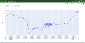
- The following example shows a particular company stock performance in given period. [here we took hdfc bank ltd example]
#Analyzing particular share price in particular period
import pandas as pd
#pip install plotly
import plotly.express as px
df = pd.read_csv('HBD.csv')
fig = px.line(df, x = 'HBD_x', y = 'HBD_y', title='HDFC Shares prices 2019-20')
fig.show()
To download HBD.csv file, click here or you can google it.
Output of above example is :
2. Student performance
import matplotlib.pyplot as plt
import csv
x=[]
y=[]
with open('student_data.csv', 'r') as csvfile:
    plots= csv.reader(csvfile, delimiter=',')
    for row in plots:
        x.append(str(row[0]))
        y.append(str(row[1]))
plt.plot(x,y, marker='o')
#plt.bar(x,y)
plt.title('Student Marks Information')
plt.xlabel('Names')
plt.ylabel('Marks')
plt.show()
Prepare .csv file as following for above example

Output of above example is :

3. Course enrollment details
#Data Visualizing using Python
import numpy as np
import matplotlib.pyplot as plt
# creating the dataset
data = {'C':20, 'C++':15, 'Java':30, 'Python':35}
courses = list(data.keys())
values = list(data.values())
fig = plt.figure(figsize = (5, 2))
# creating the bar plot
plt.bar(courses, values, color ='green', width = 0.5)
plt.xlabel("Courses offered")
plt.ylabel("No. of students enrolled")
plt.title("Students enrolled in different courses")
plt.show()
Output of above example is :

4. Following example shows BSE [Bombay Stock Exchange] Market performance during – 2019-2020
# BSE market data analysis - 2019-20
import pandas as pd
#pip install plotly
import plotly.express as px
df = pd.read_csv('BSESN.csv')
fig = px.line(df, x = 'Date', y='Value', title='BSE Market Price Analysis 2019-20') #use px.bar, px.scatter
fig.show()
To download BSESN.csv file, click here or you can google it.
Output of above example is :

5. The following example[pie chart] shows population records from few Asian countries.
#Data Analysis and Visualization using  pie chart
import plotly.express as px
import numpy

# Random Data
random_x = [1300000000, 1450000000, 120000000, 12000000, 180000000]
countries= ['India', 'China', 'Japan', 'Bangladesh', 'Pakistan']

fig = px.pie(values=random_x, names=countries, title='Asian countries population')
fig.show()
Output of above example is :

6. Now, following example shows India’s increase in population, life expectancy , GDP / Per capita income etc from 1952 to 2007.
#population chart : lifexp, gdppercapita etc.
import plotly.express as px
data = px.data.gapminder()

data_india = data[data.country == 'India']
fig = px.bar(data_india, x='year', y='pop',
             hover_data=['lifeExp', 'gdpPercap'], color='lifeExp',
             labels={'pop':'population of India'}, height=400)
fig.show()
Output of above example is :

Thanks for scrolling !!!


