Bootstrap Navigation Bar
To create navigation bar for your website with using Bootstrap is quite easy.
Just copy the following tag and paste it into notepad, save with .html extension.
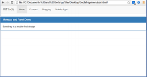
<!DOCTYPE html>
<html lang="en">
<head>
 <title>Bootstrap Examples</title>
 <meta charset="utf-8">
 <meta name="viewport" content="width=device-width,
initial-scale=1">
 <link rel="stylesheet"
href="https://maxcdn.bootstrapcdn.com/bootstrap/3.3.7/cs
s/bootstrap.min.css">
 <script
src="https://ajax.googleapis.com/ajax/libs/jquery/3.1.1/jque
ry.min.js"></script>
 <script
src="https://maxcdn.bootstrapcdn.com/bootstrap/3.3.7/js/b
ootstrap.min.js"></script>
</head>
<body>

<nav class="navbar navbar-default">
 <div class="container-fluid">
 <div class="navbar-header">
 <a class="navbar-brand" href="#">MIT India</a>
 </div>
 <ul class="nav navbar-nav">
 <li class="active"><a href="#">Home</a></li>
 <li><a href="#">Courses</a></li>
 <li><a href="#">Blogging</a></li>
 <li><a href="#">Mobile Apps</a></li>
 </ul>
 </div>
</nav>

<div class="panel panel-primary">
 <div class="panel-heading">
 <h1 class="panel-title">Menubar and Panel
Demo</h1>
 </div>
 <div class="panel-body">Bootstrap is a mobile-first
design</div>
</div>
</body>
</html>
Output of the above program is…