Here in this example we will be knowing that how to show Line, Scatter and Bar Chart using Python.
For this example i downloaded a csv file called BSESN.csv from here
Lets have simple example as following
# BSE market data analysis - 2021-2022
import pandas as pd
#pip install plotly
import plotly.express as px
df = pd.read_csv('BSESN2.csv')
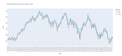
fig2 = px.line(df, x='Date',y=df.columns[2:5],title='BSE Market Price Analysis 2021-2022')
fig2.show()
fig3 = px.scatter(df, x='Date',y=df.columns[2:5],title='BSE Market Price Analysis 2021-2022')
fig3.show()
fig4 = px.bar(df, x='Date',y=df.columns[2:5],title='BSE Market Price Analysis 2021-2022')
fig4.show()
And here is the output: